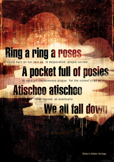
Ring a ring a roses
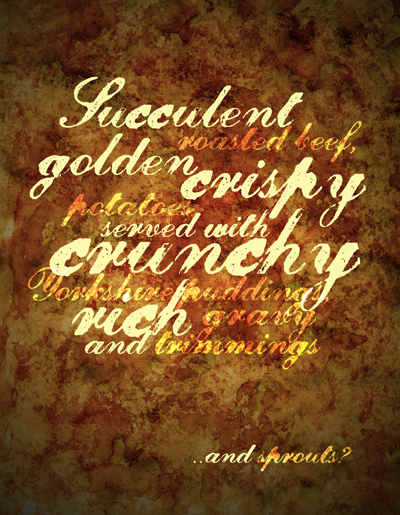
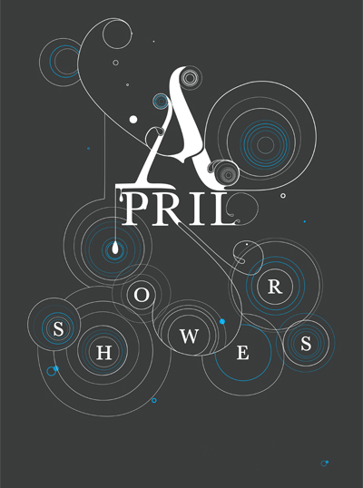
Hidden Heritage
A nursery rhyme for children associated with the Great Plague of London 1665. A rosy rash was a symptom of the plague, herb posies were carried as protection and final sneezing was fatal before death.
Arts University College Bournemouth, UK
BA(Hons) Graphic Design : Year One
Oh we do like to be beside the seaside
The British take more than 25 million trips to the seaside every year. The use of type reflects typical seaside advertising and postcard style. The words are the first line of the famous British music hall song:(1909)
Oh I do like to be beside the seaside,
I do like to be beside the sea,
I do like to stroll along the prom, prom, prom,
Where the brassbands play
Tiddley-om-pom-pom!
Arts University College Bournemouth, UK
BA(Hons) Graphic Design : Year One
Rain
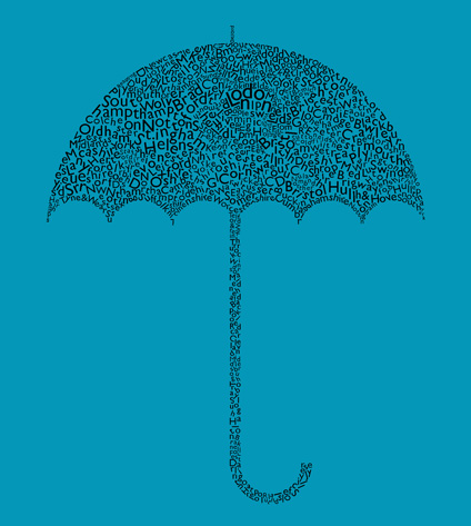
This piece was inspired by the terrible English weather this time of year. I remember when I was sketching out the idea for this it was raining and most of the time I spent on this it was raining and even as I am writing this it is raining! The umbrella is made up of all the English cities & counties and represents England and amount of rain we have. I dislike rain as much as the next person but eventually it always stops, hence the blue background.
I choose Gill Sans for these piece of work, a typical English typeface. with a clean solid look”
Buzzy Bee
I chose to depict the classic New Zealand and Australian childhood toy, the Buzzy Bee.
I used VAG Rounded as it appears to be friendly and childlike, much like fridge magnets.
I used primary red, yellow and blue for the colours of the Buzzy Bee toy itself, and also for a bright, jarring contrast to make the poster stand out.
I wanted to use the phrase “the sound of a kiwi childhood” rather than straight out “Buzzy Bee” as it is more suggestive, and I wanted to emphasize the noise the toy makes – “clickety clack”, which is also spaced throughout the page. Using different weights and leading in the words “clickety clack” it emphasizes the movement of the toy, as well as the sound it makes.
I made “sound” look as though it was vibrating, also emphasizing the movement of the toy.
The ‘i’ and ‘l’ in “child” both have dots above them to represent a parent and a child.
Massey University, Wellington, New Zealand
Second Semester Year three
Mana
Mana is defined in the dictionary as authority, control, influence, prestige, power and honour.
An important part of New Zealand Maori culture is Mana. It is a spiritual quality considered to have supernatural origin – a sacred impersonal force existing in the universe. Therefore to have mana is to have influence and authority, and efficacy, the power to perform in a given situation.This poster typographically explores both the meaning of Mana and the patterns of a traditional feathered Maori cloak worn by those with authority. The main font used shows hierarchy, boldness and power. The type placed on top of the type also reflects this. The strong bold geometric shapes replicate the patterns often found a Maori cloak and the secondary text and use of rules furthermore alludes to the feathers that dangle at the bottom.
The colours used within this poster are more contemporary than the customary black, red and white Maori colours. They are inspired by the earthy rich tones of a feathered cloak. The dominant colour purple is used because of it associations with nobility and spirituality.
Massey University, Wellington, New Zealand
Second Semester Year three
